
Every Book Has It's Cover
- Feb 2, 2015
- 2 min read
By Newton Asimov
We all know the old adage, “Don’t judge a book by its cover”. It has rang true through countless times in my life, as well as yours I’m sure. We all individually have these preconceived notions built through our experiences, shaped by our thoughts, feelings, and biasness. Being able to view the world objectively is a skill that is learned over time once we start recognizing patterns and consequences in our decisions. It is a great quote to live by but unfortunately companies do not follow this same rule. If a company is a book, then its logo is the cover.
MachinaTek has been around a year now and already we have evolved once in what we wanted our first impression to be. When we started, we laid a solid ground rule in regards to how we operated. That rule was to let the company define itself as it grows. This is something we are very passionate about. Machinatek is comprised of multiple personalities, all shaped through their own experiences. With a clear direction we melted our thoughts together and began to shape who we are.
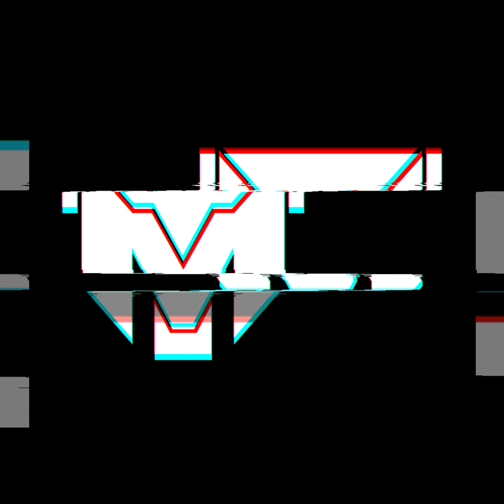
We started with the MT. Solid black. Custom built. It gave us a universal shape to use for marketing and was somewhat reminiscent of a certain toy brand that changes from car to robot. This was MT’s first hint of a brand, but as we grew, we noticed it was too corporate feeling. It was too cold and technical.
Then along came a friend who cares very deeply about this company and what we are doing. He very vocally expressed his dislike for the MT and being a graphic designer himself wanted to empower MachinaTek with what it really needed. Our personalities to shine through our brand.
The sword was born. A dynamic shape jutting through a circle. This was us breaking through what is already in place. The circle represents a never ending, monotonous way business has always been ran. We are the sword, breaking through to redefine design and how we do business. Green was chosen as a pop color to represent our commitment to being stewards to consumers, the planet, and our successful growth. It gave us a dynamic profile to use with creative marketing.
Su Mathews Hale of the design firm Lippencott wrote, “A company's logo is its shorthand, a visual cue that tells a story of the brand's culture, behavior, and values” We are MachinaTek. We are against the grain. We are breaking through the norm. We are powerful and driven.
We are MachinaTek and we are here to stay.


Comments